

I lived for more than 50 years in Holland and grew up with those fast growing watery greenhouse tomatoes. We moved to the Algarve about 17 years ago and the first time I eat the tomatoes grown in Portugal it was a big surprise for me. Did you ever taste the flavour of Portuguese tomatoes? They are full of sun!
Portugal is a major producer of tomatoes, the 2nd large tomato grower in Europe, right after Italy. The tomato is used in more than 50% of all Portuguese recipes.
They look totally different from the greenhouse tomatoes. They are not equal in size, have ridges all over, are much more firmer and at least twice the amount of weight of a greenhouse tomato. They even can look rather odd and ugly. But when you put your teeth in it, you taste the rich flavour of sun, herbs, salt and sugar!
It begins with drawings
First I try to get the feeling and the essence of the tomatoes. How do they taste? Sweet? Sour? Or something between it? How do they look like? Round, oval or another shape? What kind of colours can I find (pink, green, orange, ochre and red)?
Below you see some drawings I made, before starting to paint tomatoes on a canvas.


Underpainting
I started with an underpainting of paint left overs. It is a great way to get rid of your old dirty palette without wasting paint. And you can start with a clean new one for the new painting.


Start
I was in the mood to go more abstract than what I normally do, based on the second and third drawing. But it didn’t work out. I had no connection with it. This is not new for me. I have a lot of paintings started which I paint over again because I miss that feeling, the flow in which things follow on a rather logical way from one to the next. Everything that has no inspiration in it, has to be sacrificed.


And starting again
So I decided to start all over again with a new underpainting over the old one.
The last layer was a thin wash of beiges, ochre and some green. The paint was diluted with acrylic binder, the connecting substance in acrylic paint. It is better to dilute with that if you want a thin layer. Diluting with water will course that the paint is not firm enough to carry the next layer. You see already the drawing of the leaves too.

The leaves were also painted with a very diluted paint because I wanted them to play a role in the background.
In the free program Gimp I made a layover from the leaves with the original first drawing, to check if the composition would work.

Below you will find the different phases of the painting.


After that I forgot to photograph the following stages. I remember that I found that the painting needed more depth. So I put a very dark green in it. But that had the consequence that I had to lift up some of the leaves in the middle. So they are more in the foreground now.
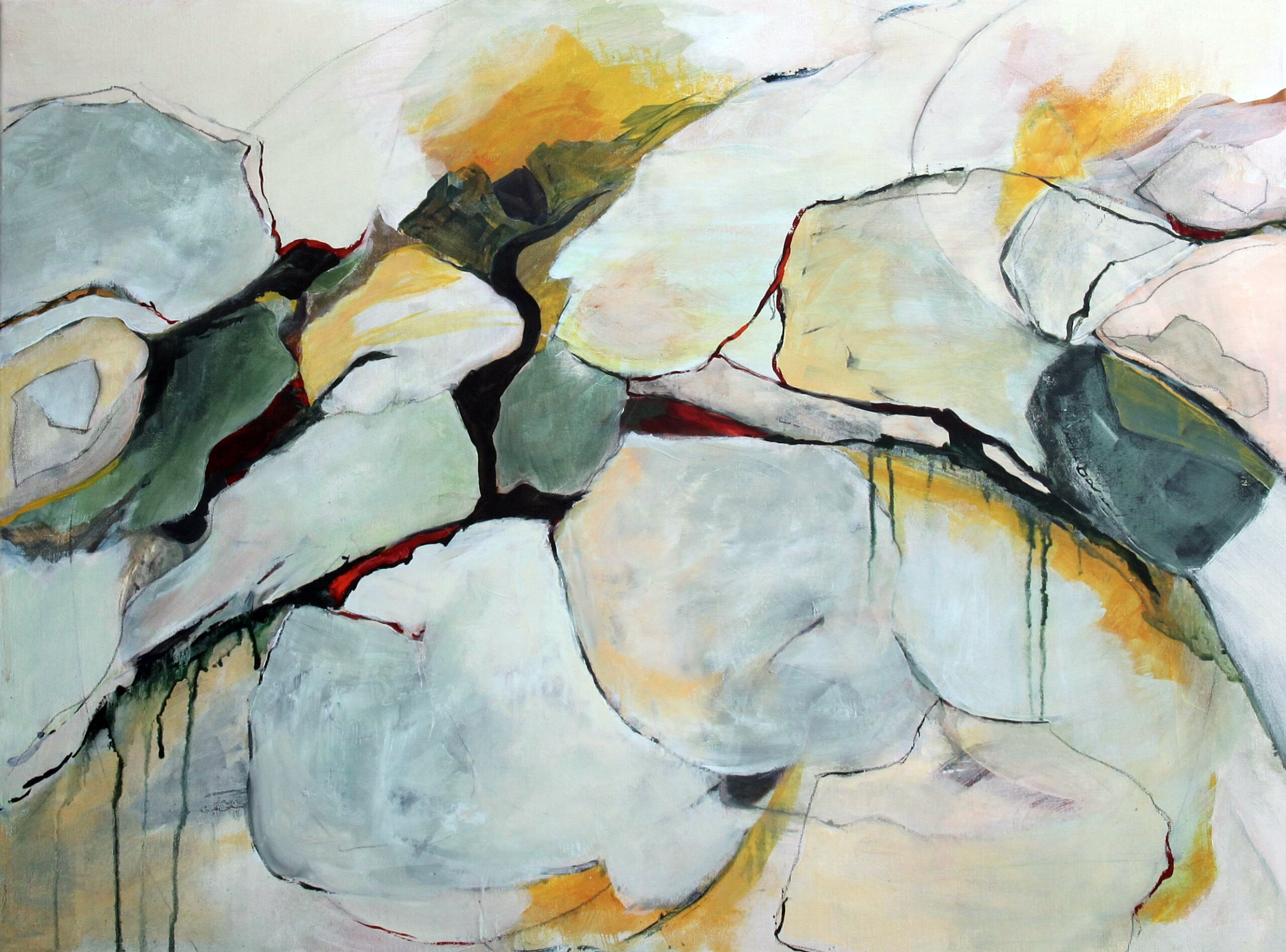
Here is the final painting. I hope you enjoy it!


You must be logged in to post a comment.